The Pain Point
Running a blog for months, the most painful thing isn't writing — it's finding the right images.
You finish writing, feeling great. Then you open a search engine — "AI design blog image high-res no copyright" — scroll through 50 pages, and everything is either ugly, watermarked, or clearly from a free stock library.
So when I found GPT Image 2 could "generate images matching your article's topic," my first thought was: Finally, I can make my own.
The biggest value of AI-generated blog graphics isn't "looking good" — it's "accurately conveying your article's message." Stock photos from the web often barely relate to your content. AI-generated images are a visual extension of your article's viewpoint.
Case 01: Cover Image Generation
Blog Cover Image — "AI Design Tools"

What worked: Cover generated. Designer at computer, screen with UI mockups and code, AI dialogue bubbles nearby. Colors match requirements. Right side blank for title text.
What didn't work: Designer figure feels templated — like a free stock photo person. Screen "mockups and code" — look closer and the code is garbled, mockups are blurry. Enlarge to phone screen and details reveal themselves.
Conclusion: Best for: concept-type covers (AI era, design trends). For covers needing real product screenshots or code, manual work still needed.
Case 02: In-Article Illustration
Designer Workflow Illustration
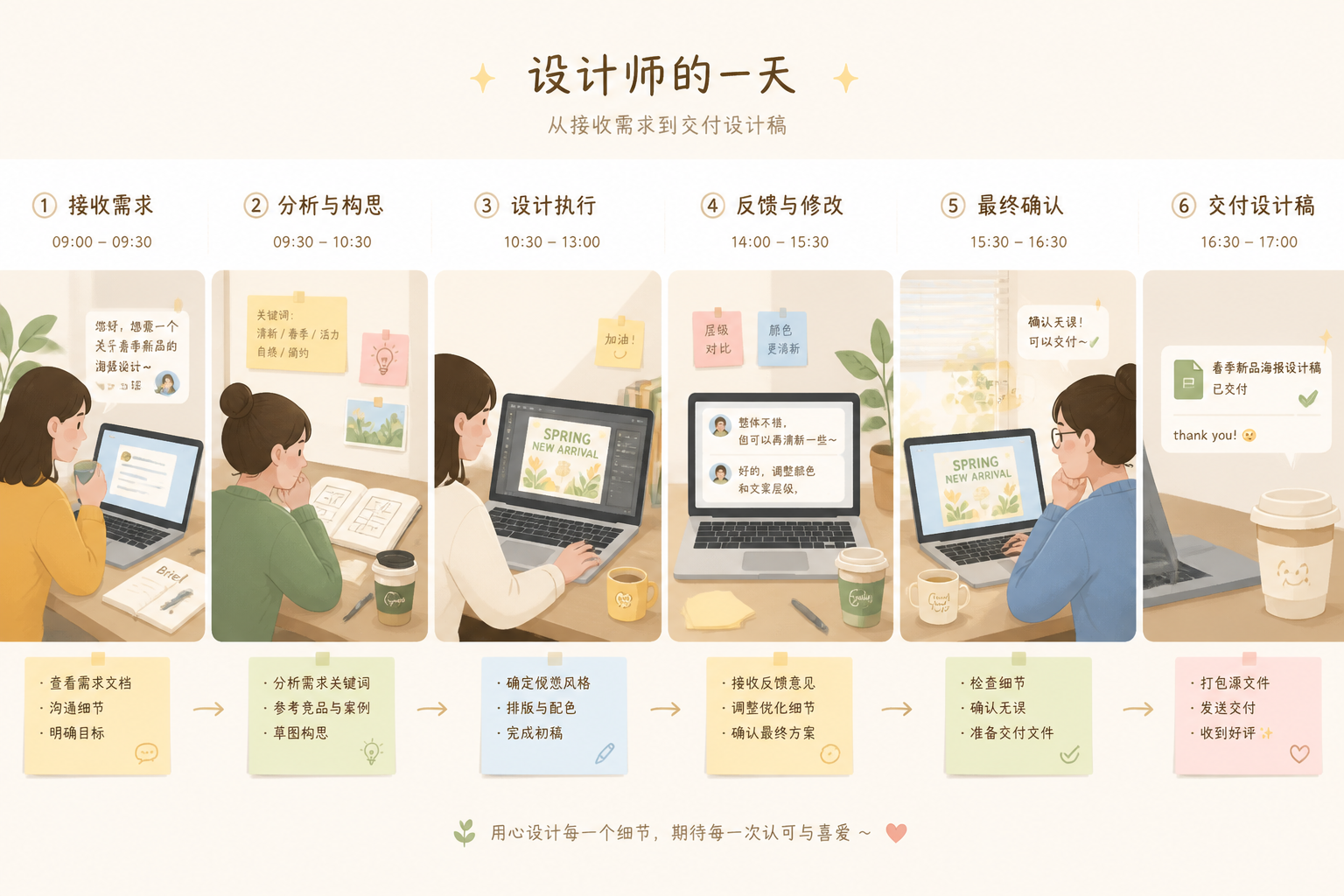
What worked: Horizontal wide image generated. Several work scenes with laptop, coffee cup, sticky notes. Flat illustration style with soft colors — doesn't distract from body text.
What didn't work: Text on sticky notes is garbled — AI still can't render precise readable text in illustrations. Scenes feel somewhat disconnected — not a "smooth day" flow but "scenes pasted together."
Conclusion: In-article illustrations: GPT Image 2 performs better than cover images. Body illustrations don't need "precise specific information," just atmosphere and readability. AI-generated illustrations already meet blog publication standards.
Case 03: Section Divider Elements
Blog Article Section Divider
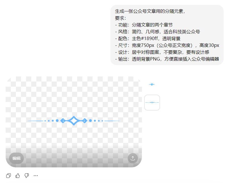
What worked: Divider element generated. Geometric, minimalist, transparent background included.
What didn't work: Transparent background edge quality is average — fuzzy edges when enlarged. For high-precision needs (million-follower accounts), may need Photoshop edge fix.
Conclusion: Section divider generation: one of the most practical blog graphics use cases for GPT Image 2. Doesn't need precise information delivery — just look good and consistent. AI can batch generate 10 styles; pick your favorite.
Case 04: Series-Consistent Covers
AI Tool Review Series Covers (3 Articles)
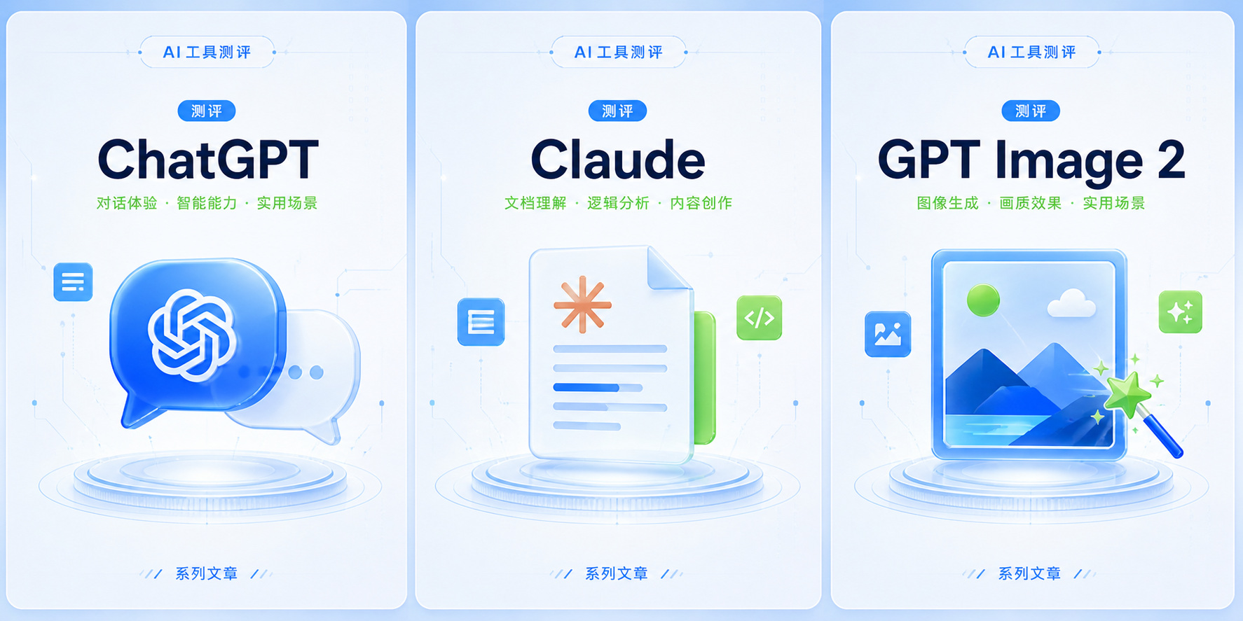
What worked: All 3 covers generated. Colors unified, composition follows "centered + title space."
What didn't work: Consistency control problems appear again. 3 covers have similar "modern tech feel" but details differ. ChatGPT cover's "chat bubble" texture doesn't perfectly match Claude cover's "document" texture.
Conclusion: Series-consistent cover generation: GPT Image 2 achieves 70-80%. For extremely high series consistency needs (paid newsletter covers), use AI for inspiration then manually unify in Figma.
Case 05: Quote Card Generation
Designer Quote Card Image
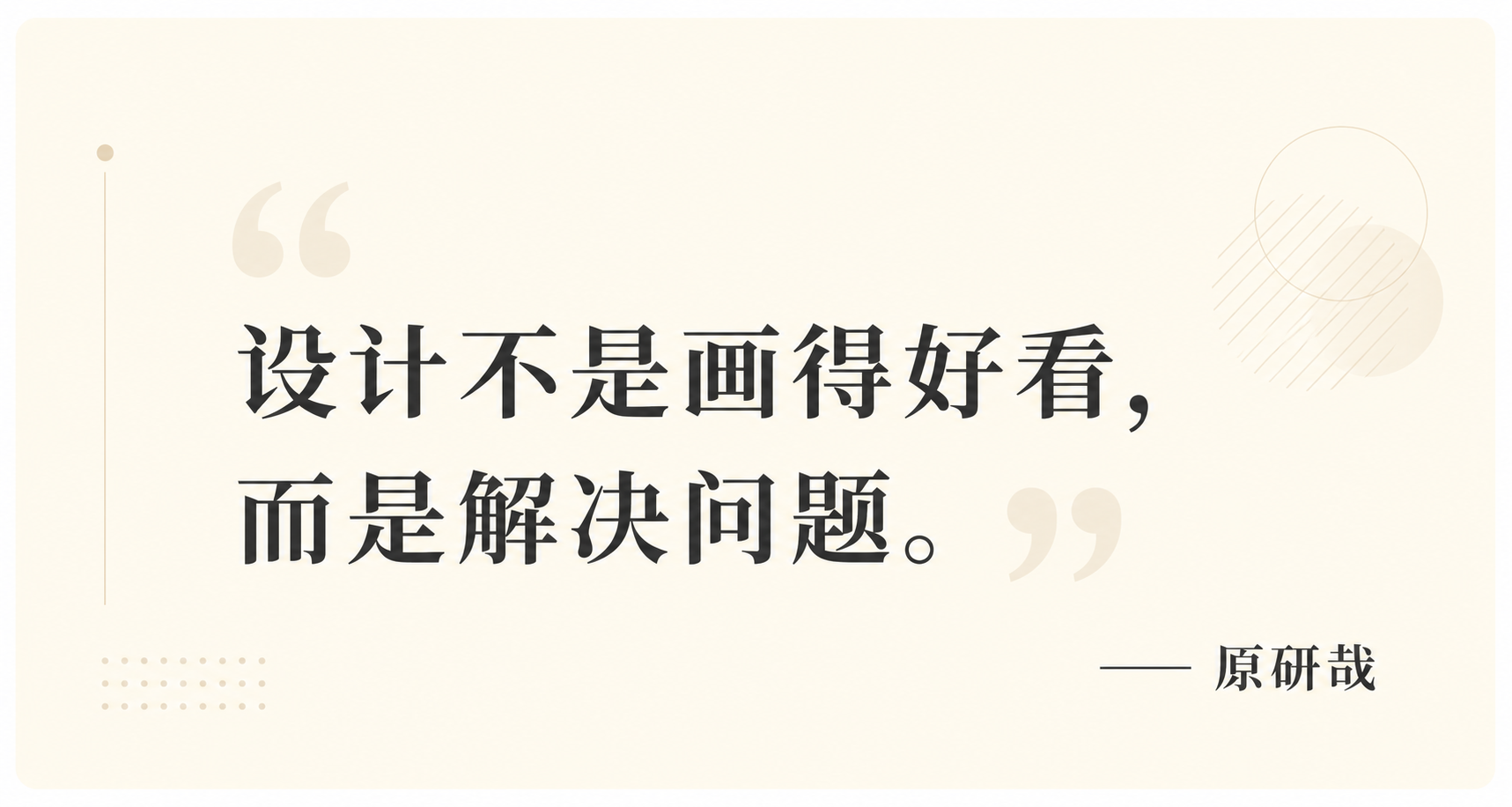
What worked: Quote card generated. "Design is not about making things look good..." text rendered correctly.
What didn't work: "Kenya Hara" — text rendered correctly but font isn't Hara's typical minimalist style. Quotation mark visual treatment feels templated — like Canva default template.
Conclusion: Quote card generation: greatest advantage is "accurate text rendering." Previously, generating images with text using Midjourney had very low success rate. GPT Image 2 achieves 70-80% accuracy. If font requirements aren't extreme, quote cards can be directly AI-generated.
Case 06: Info Long-Image Generation
2026 Designer Survival Guide Summary Image
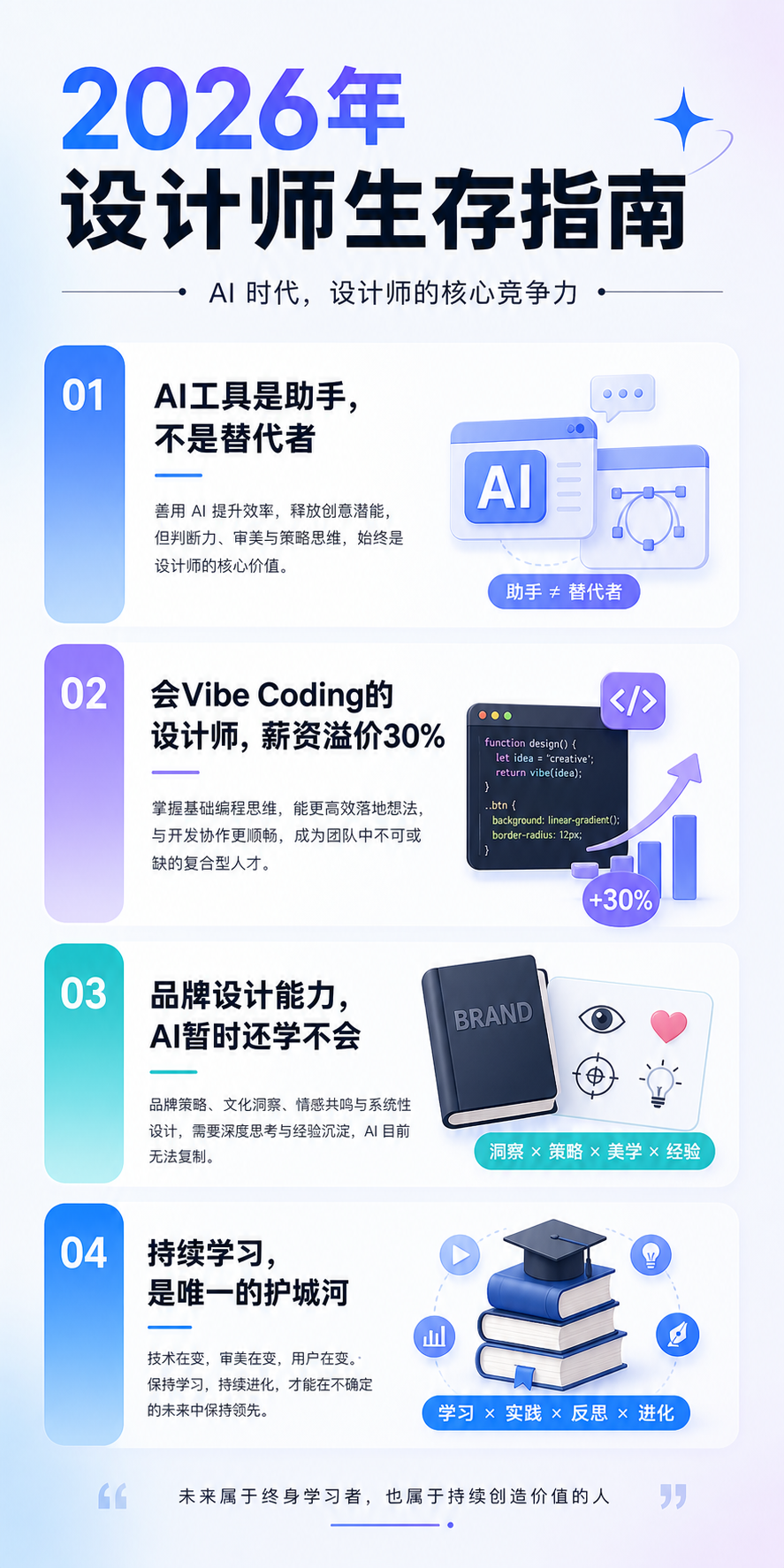
What worked: Info long-image generated. All 4 points with small icons.
What didn't work: Small icon styles not entirely consistent (some flat, some slightly 3D). If you want this in an article, may need Photoshop to fix icon consistency.
Conclusion: Info long-image generation: good for "article summary images" or "shareable images." Not "dump text into AI and get finished image." My recommended flow: use GPT Image 2 for rough layout → refine text and icons in Figma → output final long-image.
Case 07: Meme-Style Graphics
Designer Life Emoji Pack
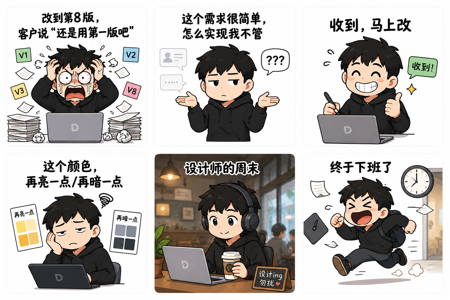
What worked: All 6 emojis generated. Topics like "8th revision," "simple requirement," "will change right away" — relatable for designers.
What didn't work: "Exaggerated" feel isn't strong enough — more like "illustrations with expressions" rather than "real emoji packs." If you put these on WeChat emoji store, quality isn't enough compared to viral ones.
Conclusion: Emoji generation: good for "funny article illustrations," not for "downloadable emoji packs." WeChat emoji packs have strict size, format, transparent background requirements — AI can't achieve this precision yet.
Case 08: Follow/Subscribe Guide Image
Blog Article Subscribe Guide
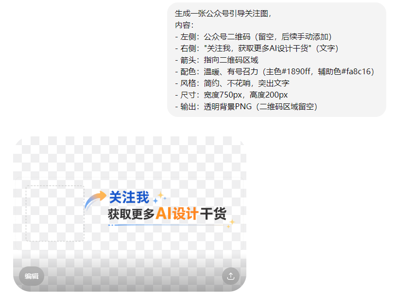
What worked: Guide image generated. Arrow, text, layout all correct. "Transparent background PNG" — AI understood real transparency. "QR code area left blank" — AI achieved this requirement.
Conclusion: Subscribe guide generation: AI generates the layout, human adds the QR code. Very practical workflow.
The Verdict
GPT Image 2 can't fully replace the traditional "find image + Photoshop" workflow, but it can relieve "image anxiety" by 60-70%.
Previously, after writing an article you still spent 30 minutes finding images, adjusting sizes, removing watermarks. Now, after writing, spend 5 minutes writing a prompt, AI generates 4 cover options, pick the best, tweak slightly — publish.
My recommended workflow: Article written → Use GPT Image 2 to generate 4 image options → Pick the best → If details need fixing, micro-adjust in Figma/PS → Publish.
Summary Table
| Case | Type | Rating | Best Use |
|---|---|---|---|
| 01 | Cover Image | 4/5 | Concept covers directly usable; specific products need editing |
| 02 | In-Article Illustration | 5/5 | Most suitable for AI generation, atmosphere is spot-on |
| 03 | Section Divider | 5/5 | Very practical, batch generate and pick best |
| 04 | Series Covers | 3/5 | Achieves 70-80%, extreme series needs manual work |
| 05 | Quote Card | 4/5 | Text is accurate, can be used directly |
| 06 | Info Long-Image | 4/5 | AI drafts initial version, Figma optimizes final |
| 07 | Meme Graphics | 3/5 | Good for article illustrations, not downloadable packs |
| 08 | Subscribe Guide | 4/5 | AI generates layout, human adds QR code |
My Honest Recommendation
It can't fully replace traditional workflows, but relieves "image anxiety" by 60-70%.
For high-frequency content creators, this time difference has enormous value.
Article written → GPT Image 2 generates 4 image options → Pick the best → If details need fixing, micro-adjust in Figma/PS → Publish.